What I'd like to do...Shelves

    I am seriously lacking space in my small teeny tiny bedroom, and while I've managed to cram tons of stuff in there ( bed, side table, reading nook, dresser, desk nook, ottoman) I feel as though my small dresser has become the dumping grounds for all of my everyday stuff. So, the pretty little "staged" dresser top quickly became the messy dresser top. In order to get the pretty back I knew there was only one answer. With no space to go out I knew I would have to go up!

    That's when I did a little google searching and found this picture of a desk nook similar to mine that took advantage of upwards space. The shelves are Ikea...so off with my boyfriend Gerry I went until I came back with 2 of the same shelves + brackets. I really wanted 3 but I feel like I might make the ceiling appear short if I do, but the more I look at my inspiration photo the more I like it...I may just go back for an extra shelf and brackets. What do you think?

    inspiration photo

    my desk nook (the picture is cropped, do not worry the ceilings are actually taller)

    I also plan on staggering the shelves, so they don't line up...I like this look better, plus I have to work around a light switch so this option will work out better for me.

    Hope to post pictures soon, so stay tuned!

    BY THE WAY IF YOU HAVEN'T ALREADY, MAKE SURE YOU ENTER THIS MONTH'S GIVEAWAY here.

Highlights of the Home Show

    This was my first year ever going to the annual Home Show. I always see it advertised in my Style at Home magazine every year around this time. I always say to myself that I am going to go and I never do for one reason or another. This year however my dear friend Miranda had some extra tickets and invited me. I was pretty excited to go, thinking I would meet all the great HGTV personalities...and hoping to get a glimpse of Sarah Richardson!

    Alas I have to say that I was pretty disappointed that not only did I not meet my favourite Canadian designers but that a lot of the show was well just that... a show! Product demonstrators, lots of paper pamphlets, flyers...no giveaways, no free stuff, at least not for me!

    I did see a few pieces of furniture and home decor products that I liked, but for all the hype it wasn't all that great. I don't know maybe it was just me?

    On a side note, I angered a vendor when I took a picture of some of his vintage stamps, apparently I was committing "copyright infringement"  but I didn't see a sign that said no taking pictures...so I hope you enjoy them! LOL

    p.s. I did get a glimpse of Glen Peloso from Restaurant Makeover fame, so that was kind of nice.

    What about you guys have you ever been to the Home Show here in Toronto? What about in your own home towns, any good design shows?

    large bath shaped like a spoon

    I love claw foot baths
    Glen Peloso chatting with fans


    so pretty...love the bling
    Large industrial floor lamp, would look great in a loft space


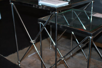
    nesting tables


    cute soap bars
    fish bowl

    neat prints
    the "infamous" stamps

Retail Therapy

    Ever since I got this house I have been putting all my time and $$$$$ into decorating and renovating and have forgotten about my love of fashion and shopping. Well my dear friends Liz had a little retail therapy today and let's just say the animal in me came out! (pun intended...you'll understand when you see purchase #1).

    Here's what I got:

    fun leopard print rainboots
    velvet pumps

A New Giveaway...iittala Taika plates

    The nice people over at CSN stores want to collaborate with WALLPAPER to bring you a new giveaway. I urge all of you to check out their sites (they have over 200+ sites) with everything from barstools, to dining chairs like the Louis Ghost chairs, flatware, dinnerware, home office, home decor, outdoor living and even shoes and bags!

    They ship to both Canada and the US, an online shopping mecca full of so many products you'll need at least a few days to go through all their sites.

    So here it is this month's giveaway...

    iittala Taika plates:

    Klaus Haapaniemi’s new Taika collection for iittala merges folklore and architecture to create a modern world of ceramic dinnerware. Produced in two color schemes, Haapaniemi unveils a world of mythical creatures, animal hybrids with some human features, living within a floral and fauna based forest. This Taika plate was hand crafted by applying silk screen print design to basic white porcelain before being glazed and fired. Modern style comes to life in this dinnerware collection, maintaining iittala’s ability to mix and match pieces while adding a touch of magic to your home and everyday life.


    For this giveaway you have a few size and colour options if you are the winner:

    One of the following:

    A) Two 8.5" plates, black


    B) Two 8.5" plates, blue


    C) Two 8.5" plates, white


    D) Two 8.5" plates 1 blue and 1 white

    OR

    One of the following:

    E) One 11.75" plate, black


    F) One 11.75" plate, blue


    G) One 11.75" plate, white


    In order to enter you have to be a follower of WALLPAPER and leave a comment telling me what some of your favourite online shopping sites are, tell me which letter you prefer A, B, C etc, as well as your email address so that I may contact you for your mailing address. The contest is open until  March 3rd 2010 until 10 pm EST. The winner will be announced on Friday March 5th 2010. Open to Canada and the US.

    Good luck to everyone!

What's new...DIY lamp shade

    With the cold weather still looming I can't quite set up shop and spray paint to my hearts content...which to be quite honest sucks! I am going through spray painting withdrawal and my projects are all on the back burner. As a way to supress my craft cravings I resorted to painting with yup you guessed it acrylics!

    I wanted a reading floor lamp in my room by my reading chair. I made several trips to HomeSense but hadn't quite found what I was looking for (altough I did pick up a great new mirror which you can see in the after pictures). I went online shopping, I did find a few things I liked but they were way out of my price range.

    I was feeling hopeless when I remembered that I had this old Ikea floor lamp in off white that had been gifted to me. Off I went with my black acrylic paint and here is the result:

    Here is the original lamp
    My new black lamp shade DIY style


    My new mirror

Flower arranging

    Here is my attempt at some flower arranging with a vintage blue and white vase I got a while ago... I love fresh flowers!


Grey, Black and White Inspired

    It's no lie that I love grey black and white. I especially love to decorate with it, on walls, in accessories, furniture, accents, you name it. Here are just a few examples of these classic colours done right!


The Mimran House

    I have always loved the clean and classic style of Club Monaco, so it is no surprise that founder Joe Mimran , who now runs Joe Fresh and his wife Kimberley Newport Mimran who heads Pink Tartan share a home that exudes the same classic, clean lines. Here is a tour of their "fresh" home as featured in Canadian House & Home. Enjoy!


Total Pageviews